DIE HARD
MOTION
BRANDING, PACKAGING, AND ART DIRECTION
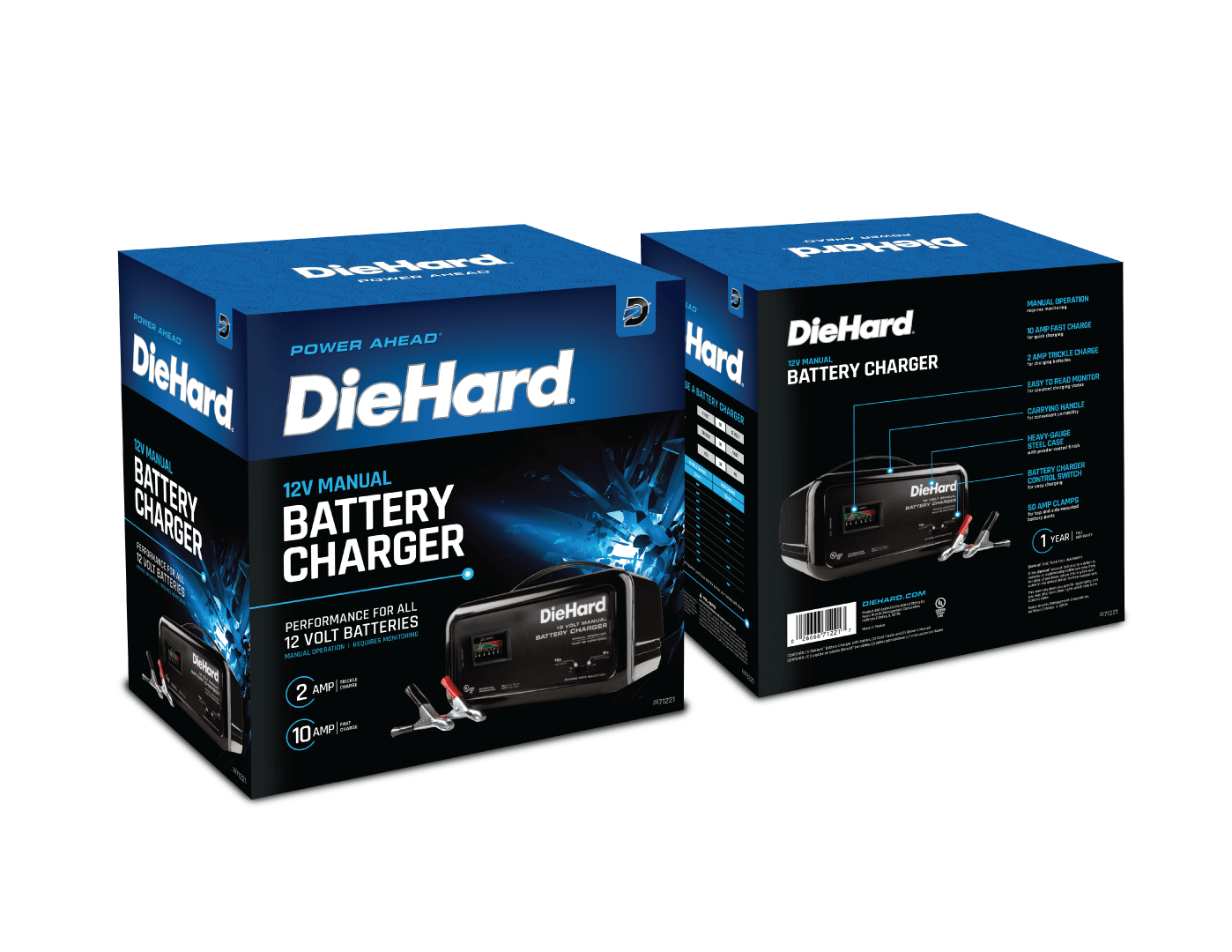
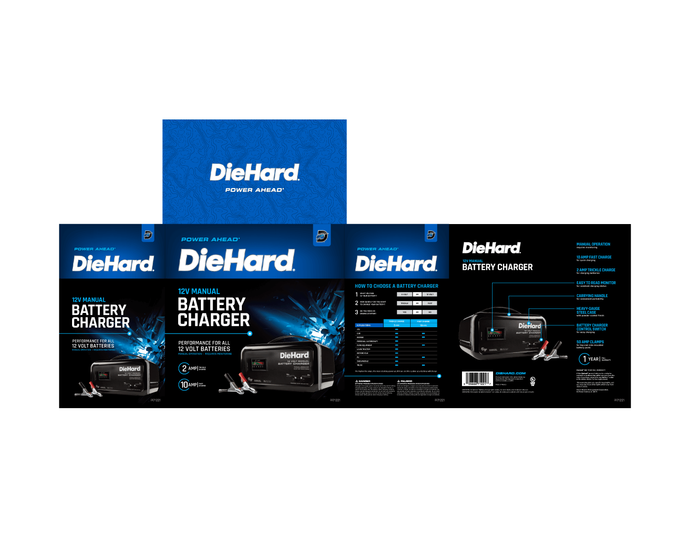
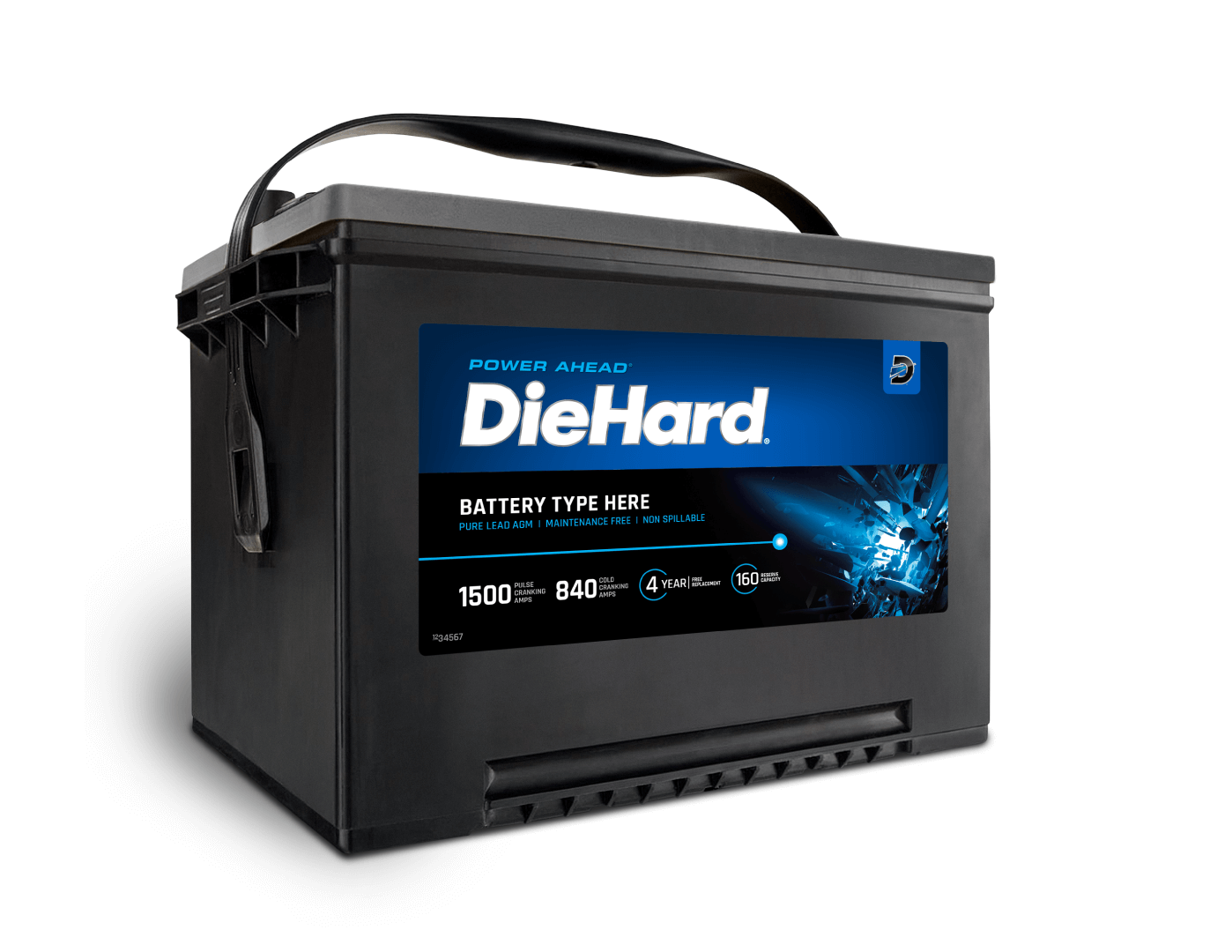
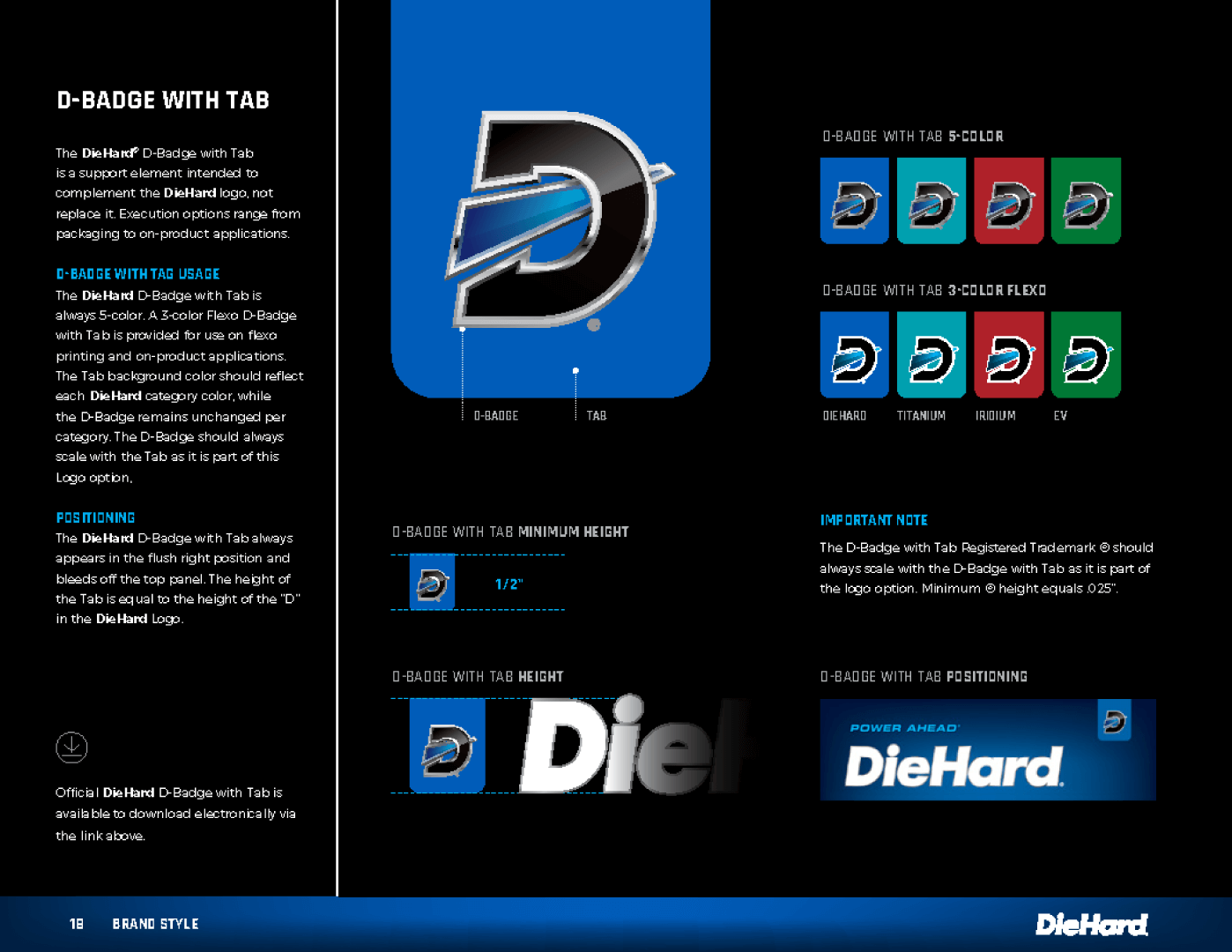
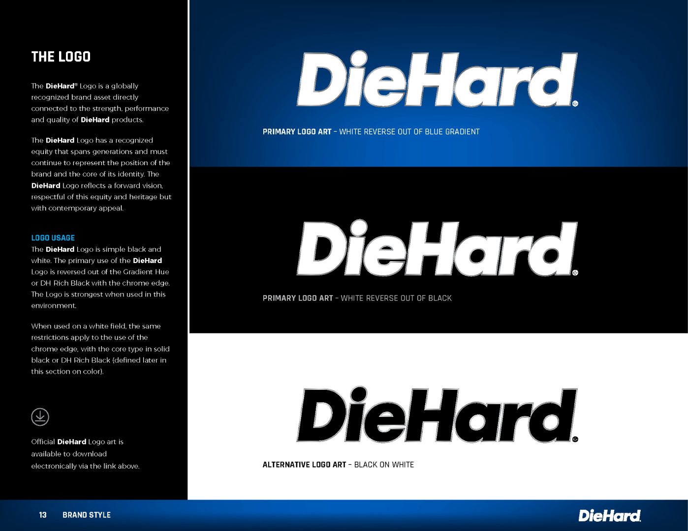
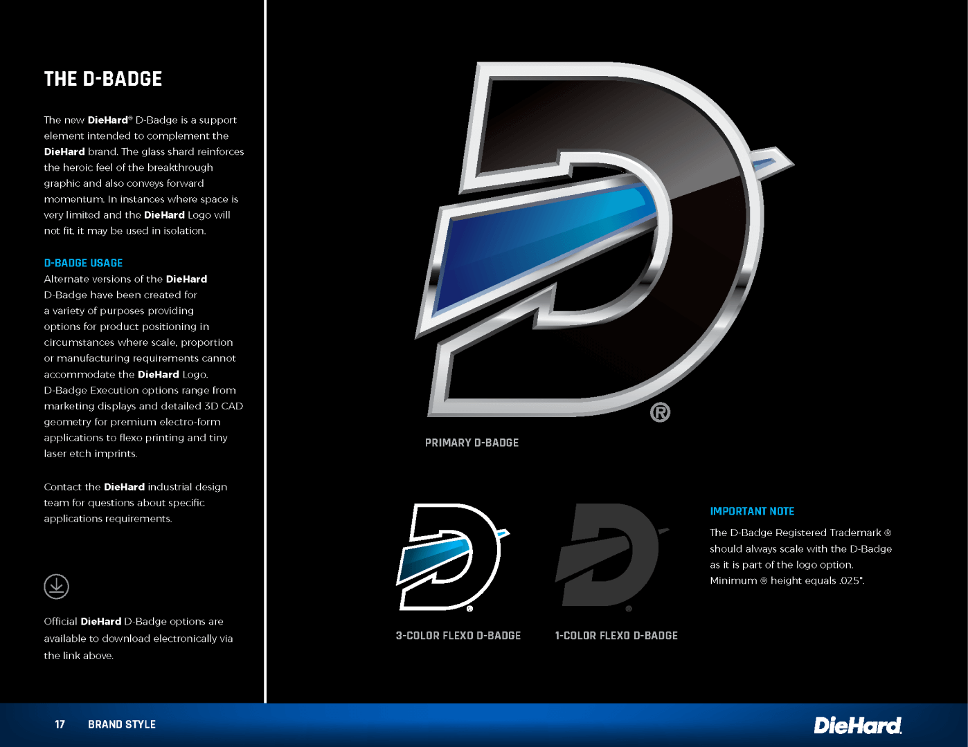
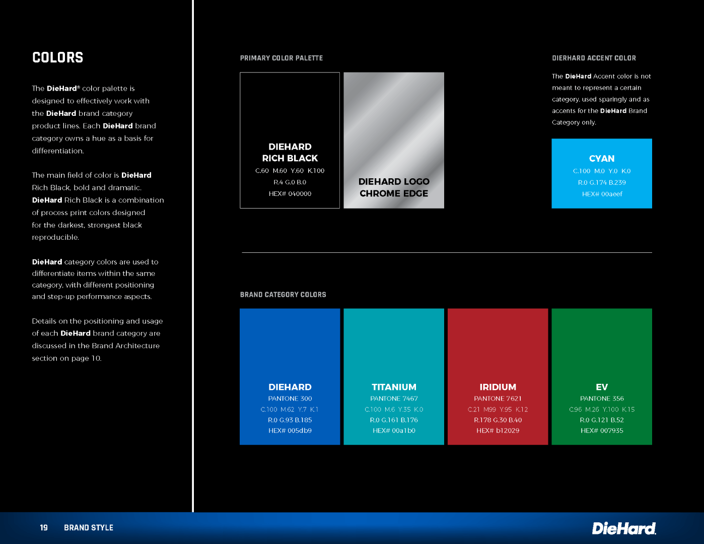
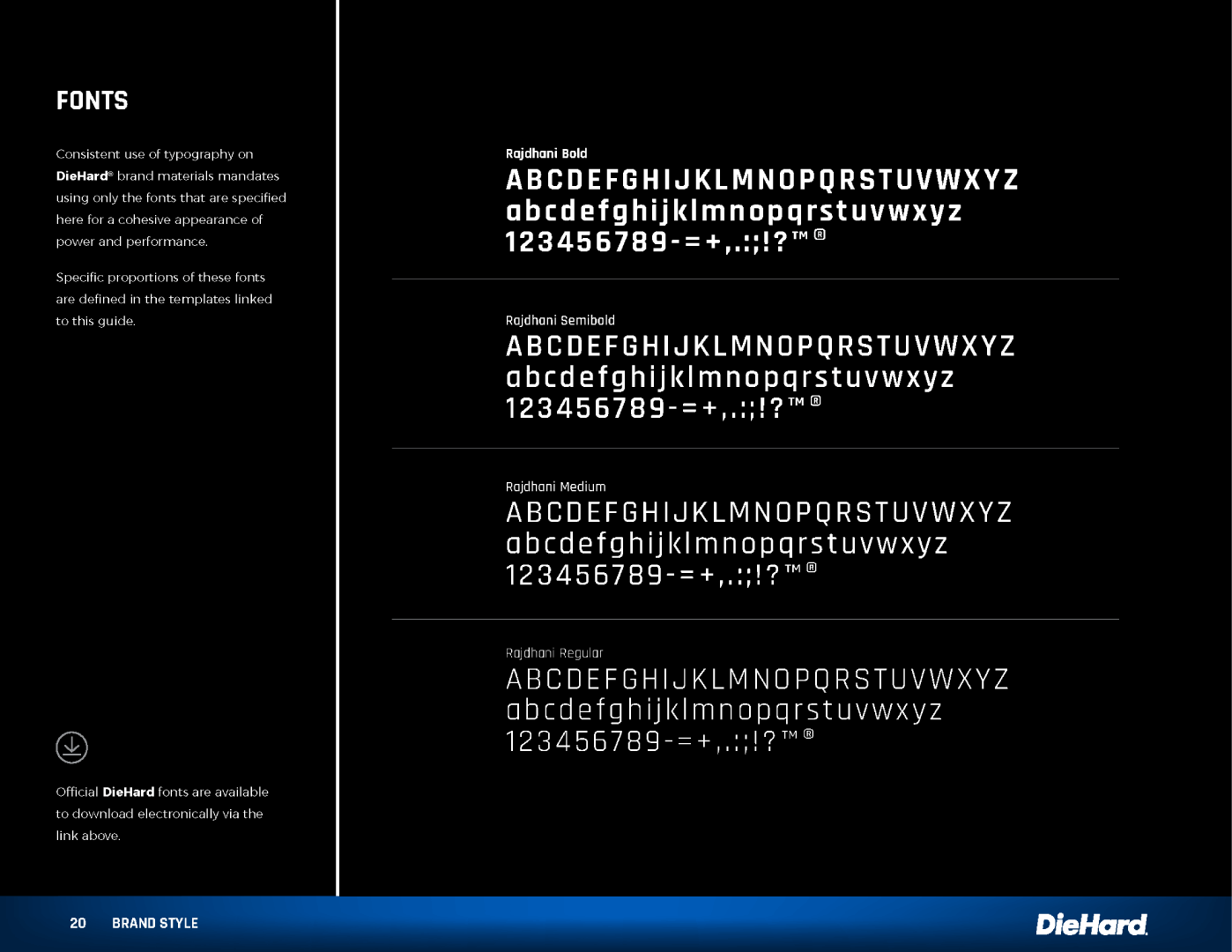
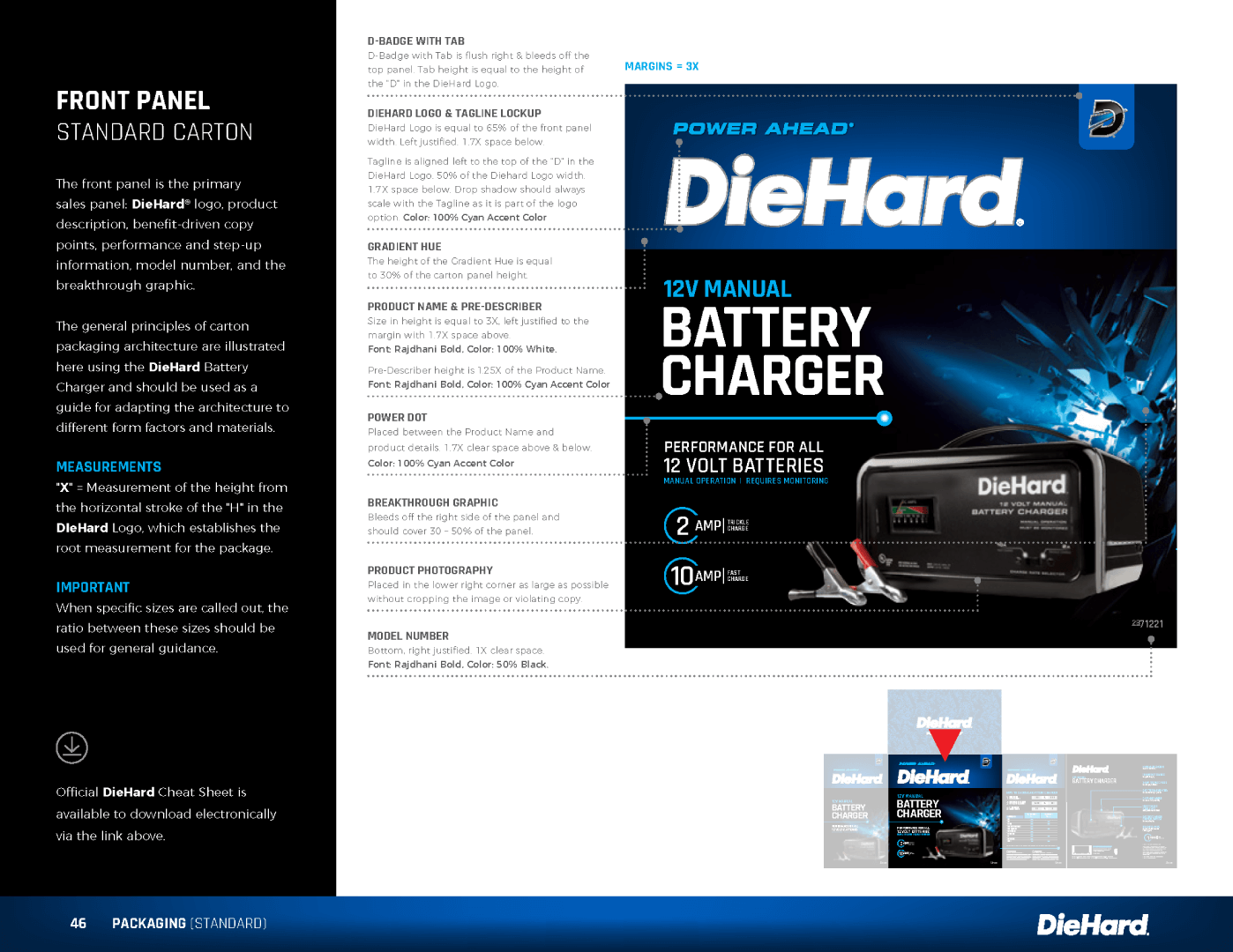
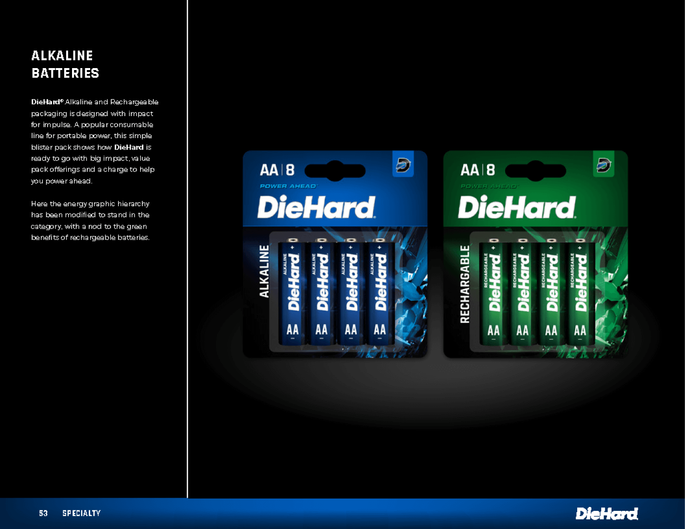
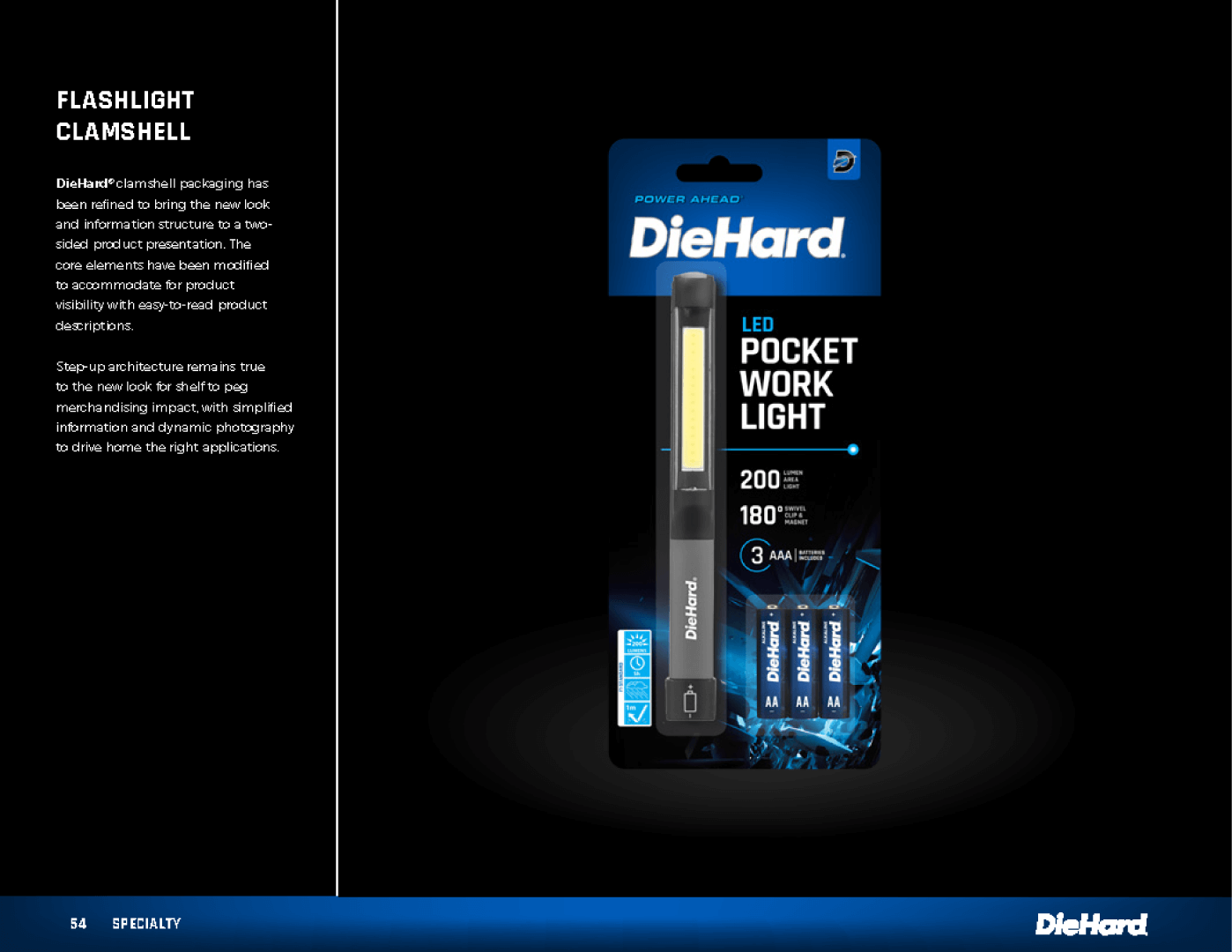
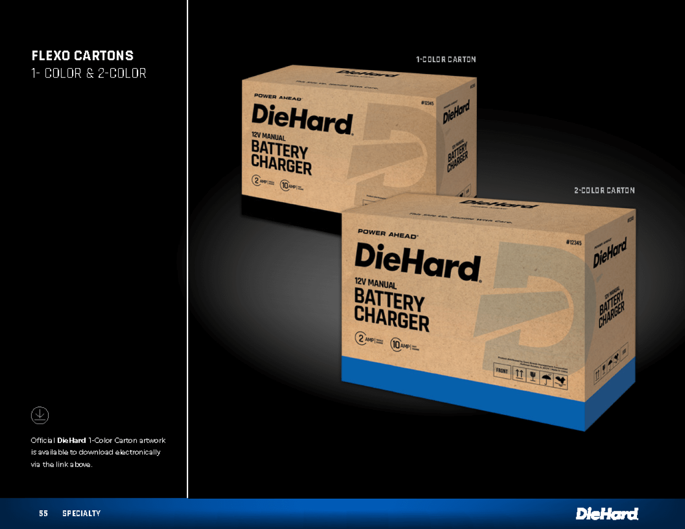
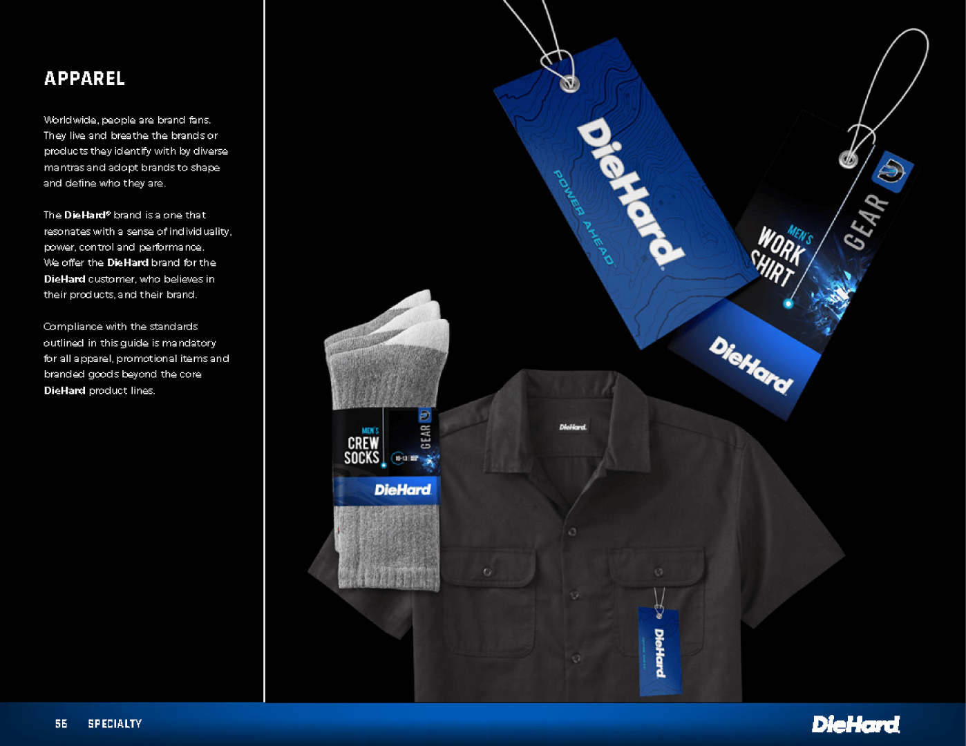
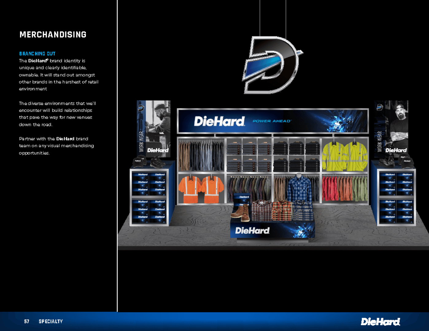
The client ask was to redefine the Die Hard brand with their new positioning and tagline “Power Head”. This included brand hierarchy, color palettes, packaging, product labels, fonts, copy tonality, and photography. This project led us to develop a 64-page brand guideline book and extend the brand into each possible category.